Lighting Design - A Third Old Project

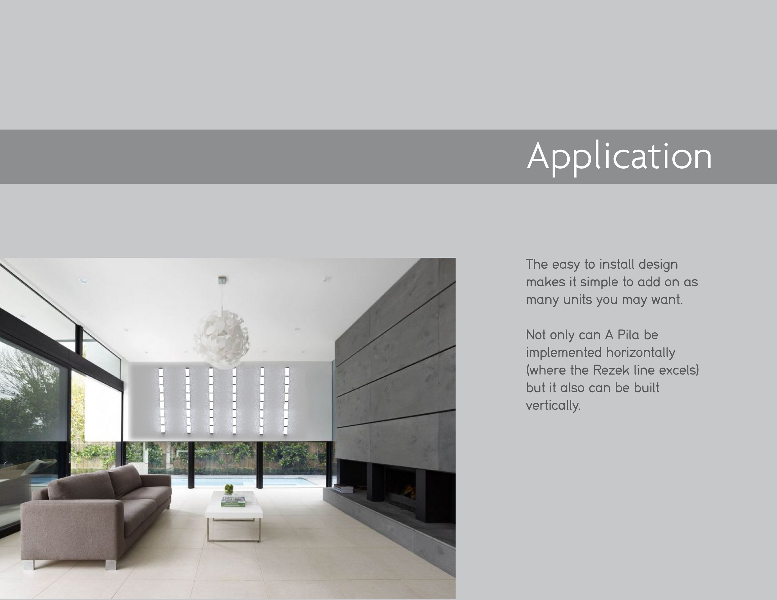
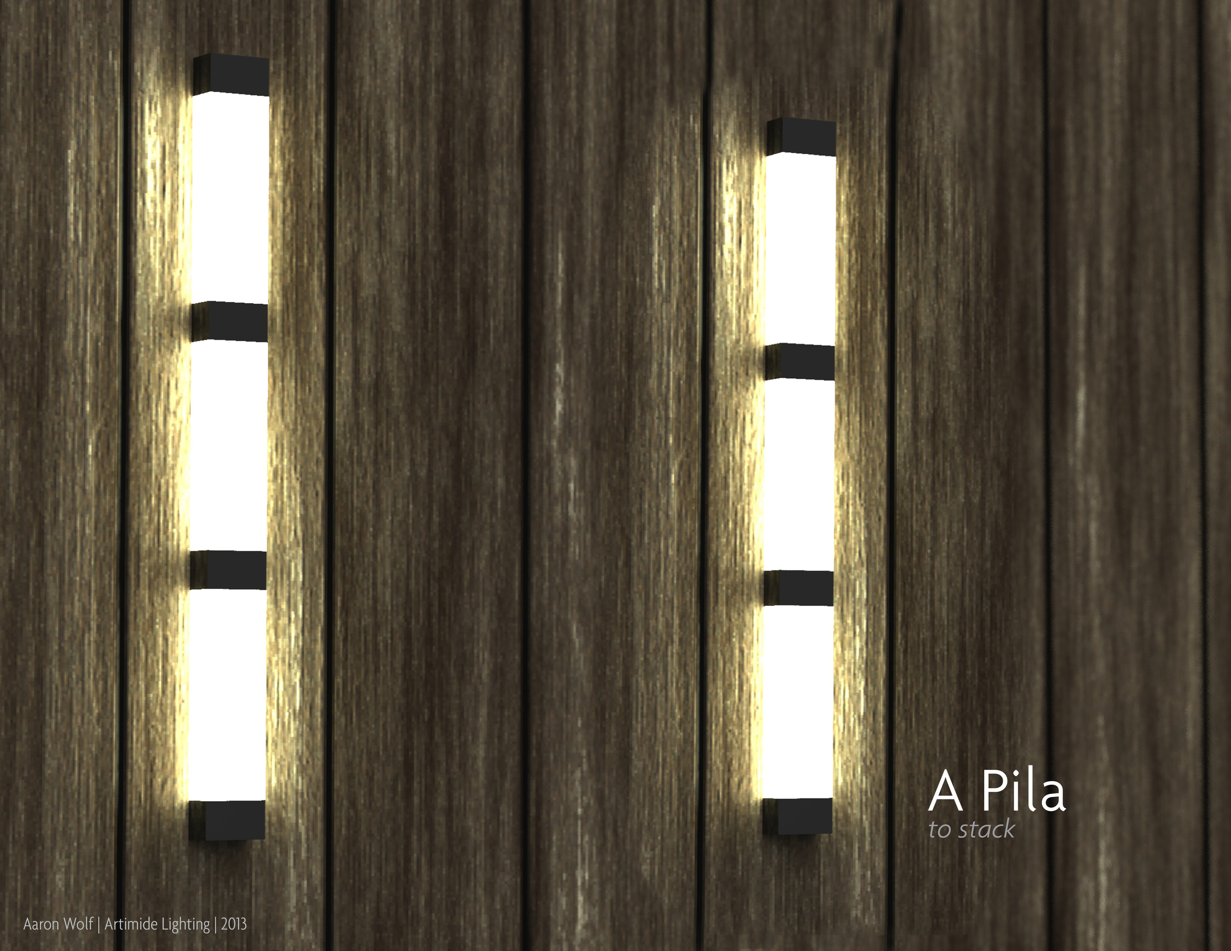
This was a project developed around the Artemide lighting catalog for my Intro to Product Design class. The main objective of this assignment was to explore Rhino (a 3D modeling program) as well as KeyShot (a 3D rendering program). 

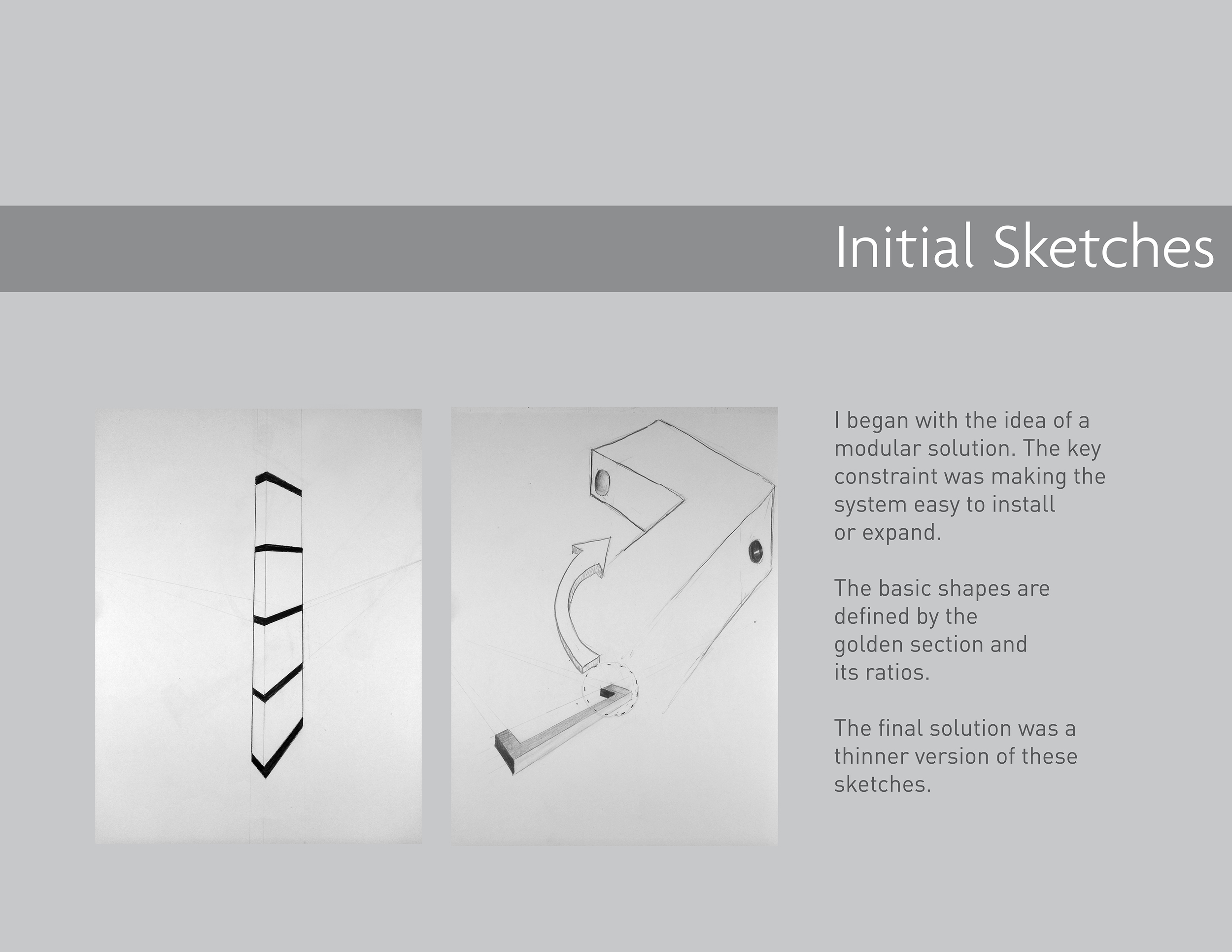
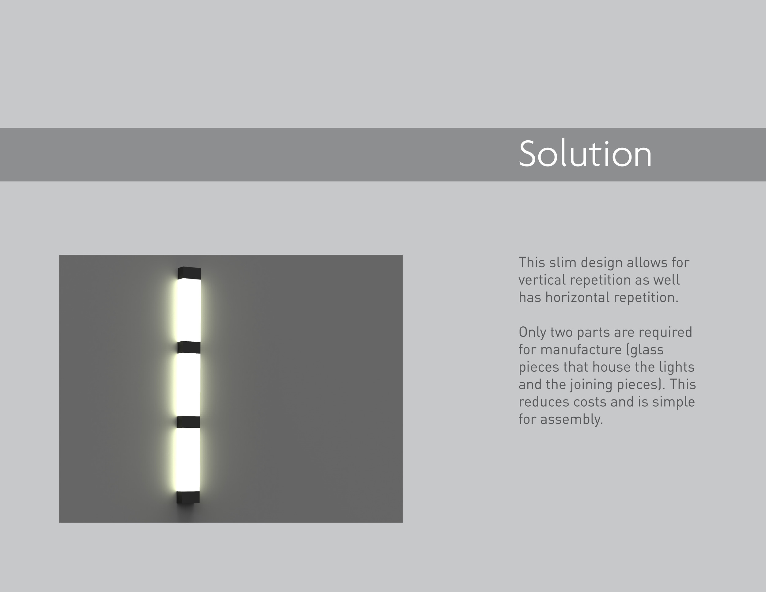
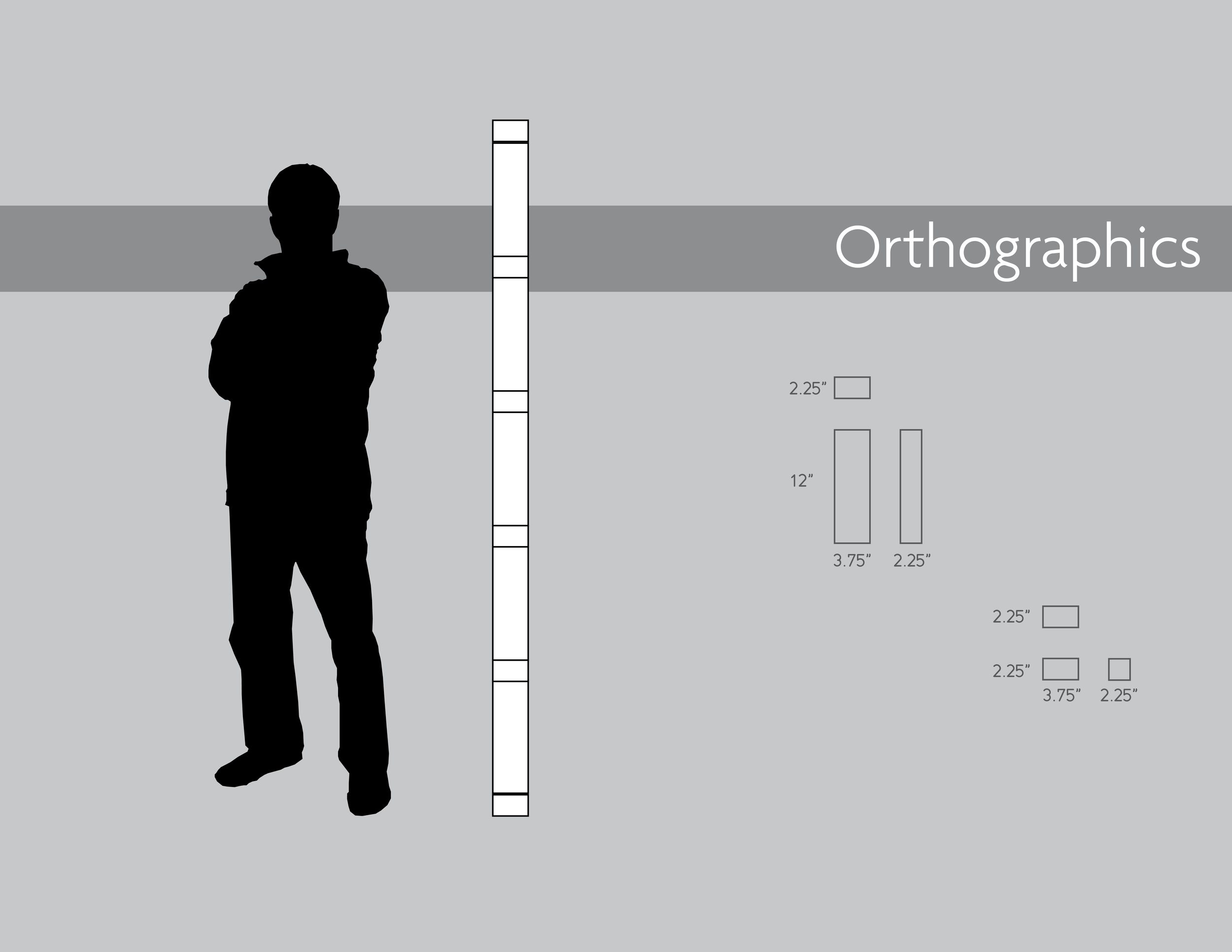
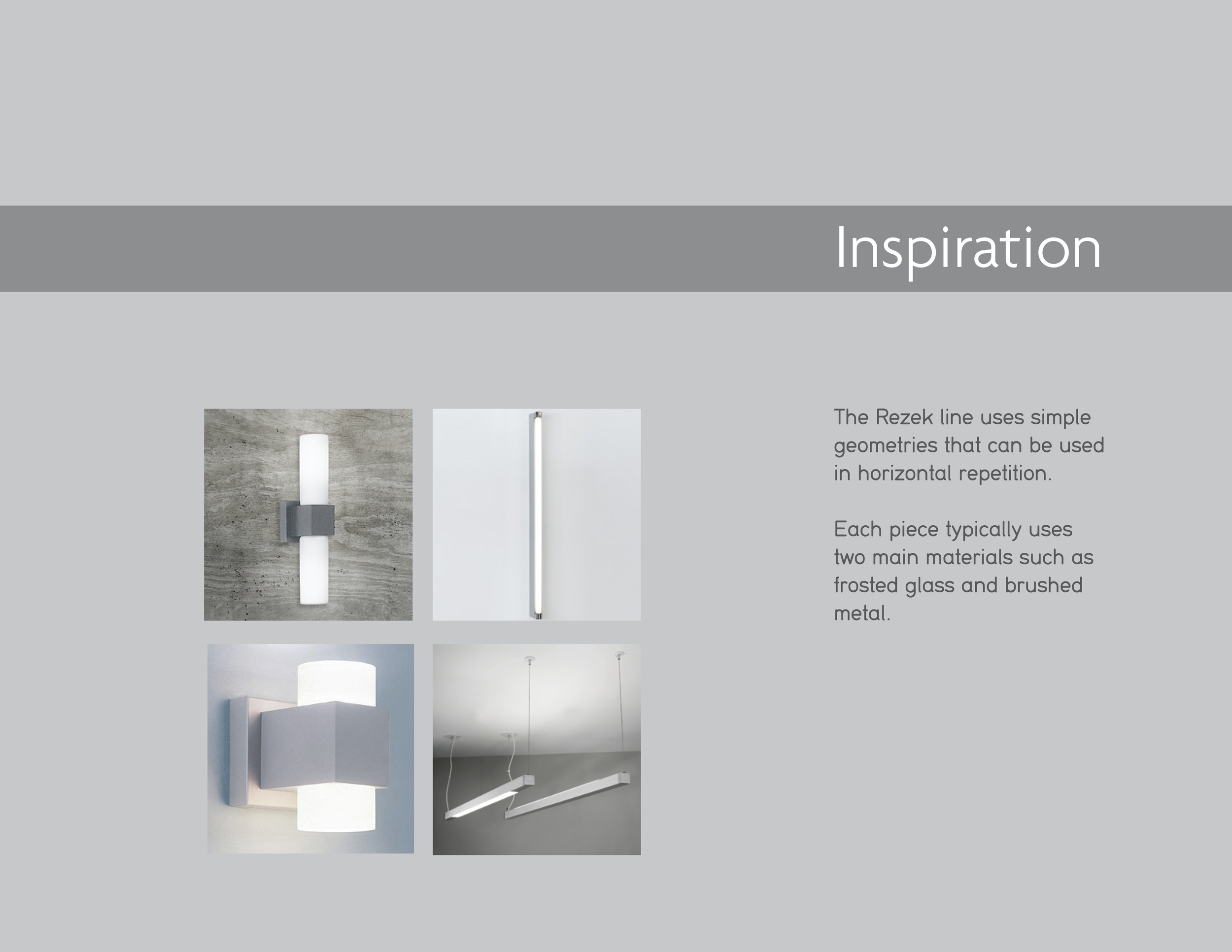
Looking at the Artemide catalog (specifically the Rezek line) it became clear that the solution had to be made of simple geometries in order to fit in the stye. 

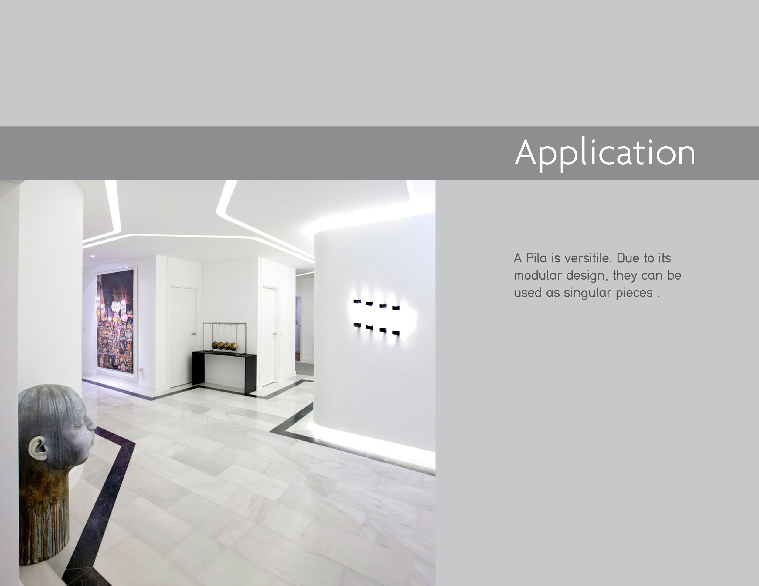
The main insight behind this design was that lighting can often be a laborious install process. Creating a solution that was modular and would only require a single energy source would mean that it could fit in a variety of solutions. 

In critique, this project was simply too simple and lacked excitement. Along those lines, easy installment of luxury lighting is not a selling point. There may have been some interesting ways to play with the interaction of turning on the lights or ways that the lights could be removed and act like flashlights until the user brings it back to its place. Maybe I should have thought about luxury emergency lighting... Anyway, I'm always interested in little side projects, so I'll probably take a look at lighting again in some ways.
Christie's Application - A Second Old Project

Before I came to the Institute of Design, I was working for Christie's Fine Art Auctioneers. While sales and various administrative duties were my primary concern, in my spare time, I created an MVP to help with the ways in which Christie's employees document art during the acquisition (customer facing) phase.

I used FileMaker Pro to create a database where employees could interact with each other in real time and enter information about clients and pieces of art. The current system was a pad and paper with an old digital camera. Additionally, if a client's piece did not make it into the formal system with real estimates from specialists, then the information would sit in physical file, unable to be accessed by anybody else. A digital solution seemed clear.

The design is obviously not the prettiest, but it was my first foray into building a real, working system. I was really excited to be building something, anything!

More than anything though, this project taught me a lot about working within a corporation. I presented the prototype in a finished format and didn't allow for other employees to get involved. Thus, only I had any real skin in the game. Had I involved others, I believe this project would have had more traction and I could have gotten more access to the real decision-makers. In addition, I left the firm to attend grad school within weeks of presenting the database, so there was nobody to represent it after I left.

Parking Application - A First Old Project

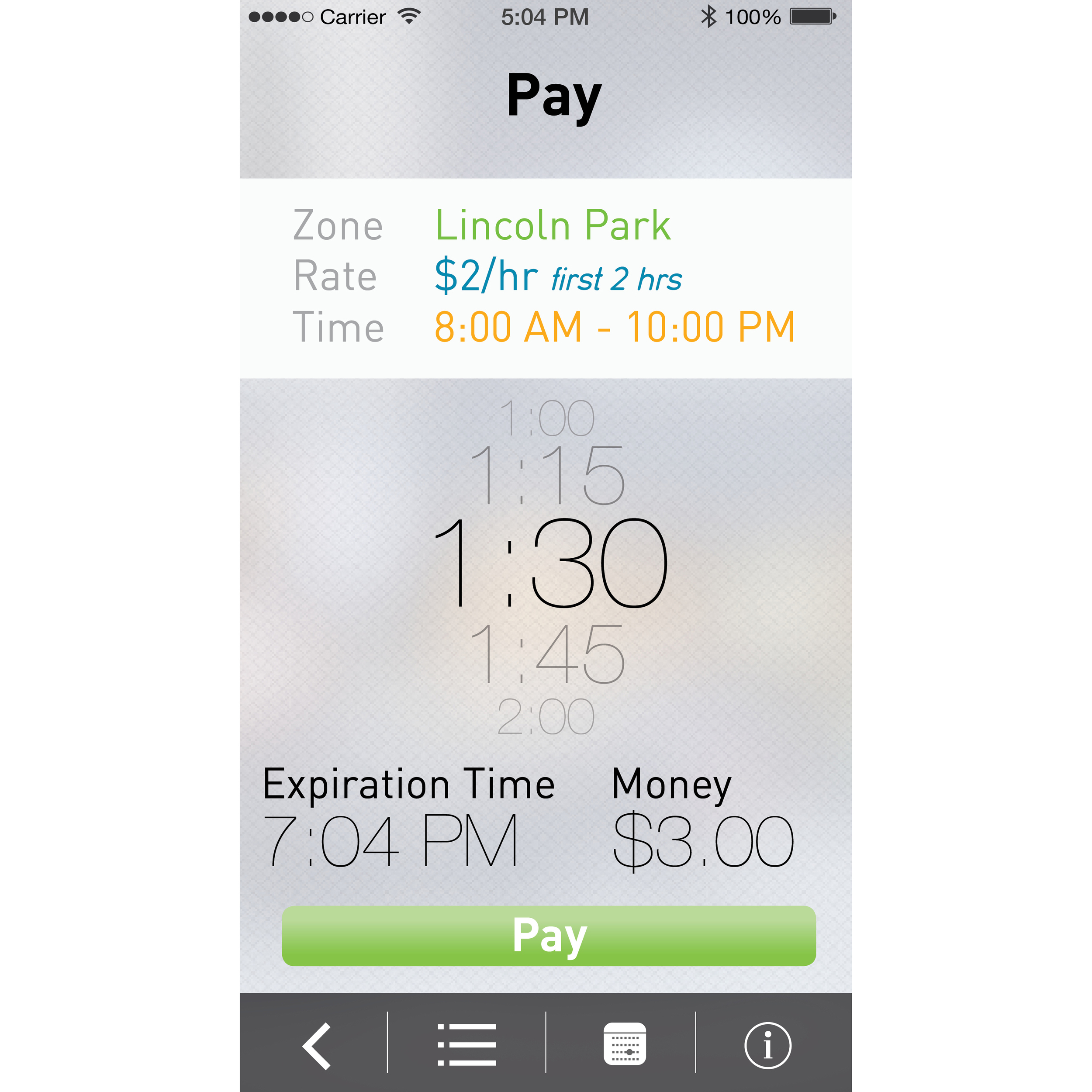
It's kind of fun to look back at some of my older work. This was an assignment given in my Intro to Communication Design I class (in 2013) where we had to create an application to make parking easier within the city of Chicago. The assignment is no longer given because ParkChicago and SpotHero now exist, but at the time, nothing existed outside of the physical parking meters. 

I realize that some of my choices were stylistic for the time (design moves quickly) but others were due to being new to the world of design. 

1. Seeing the icon is a little cringeworthy at this point. It's hopelessly forthright without even trite symbolism. At least I was playing around with opacity...

2. One interesting piece is that I notice now how chunky everything feels. Earlier versions of iOS suffered from this problem. Turns out our fingers are pretty nimble and we don't need buttons as large as our hands to make a correct selection.

3. I was going for a green color motif, however, I never really made it very clear. 

4. Nobody hates QR codes more than I do, but I decided to use one in this case. The idea was that even if you didn't have wifi, you could still use your phone to communicate with a physical parking meter to let the system know that you had parked. With the advancement of beacon and Bluetooth tech, hopefully we never have to make these decisions again.

5. I chose an interesting "swipe menu" which displays the card and car that a user might be using. After taking a human factors class, I understand that such a gesture is uncomfortable and requires the user to put the phone in a compromising position (with respect to falling out of the hand). 

6. Trying to help the user understand how much they were paying per hour and what time their parking would expire was probably the most difficult point. I used lots of different colors to try to solve this issue but I think that added too much noise to a screen with enough numbers on it already.

7. I still like the blurred background and layering effects that I used, so at least I have that going for me.