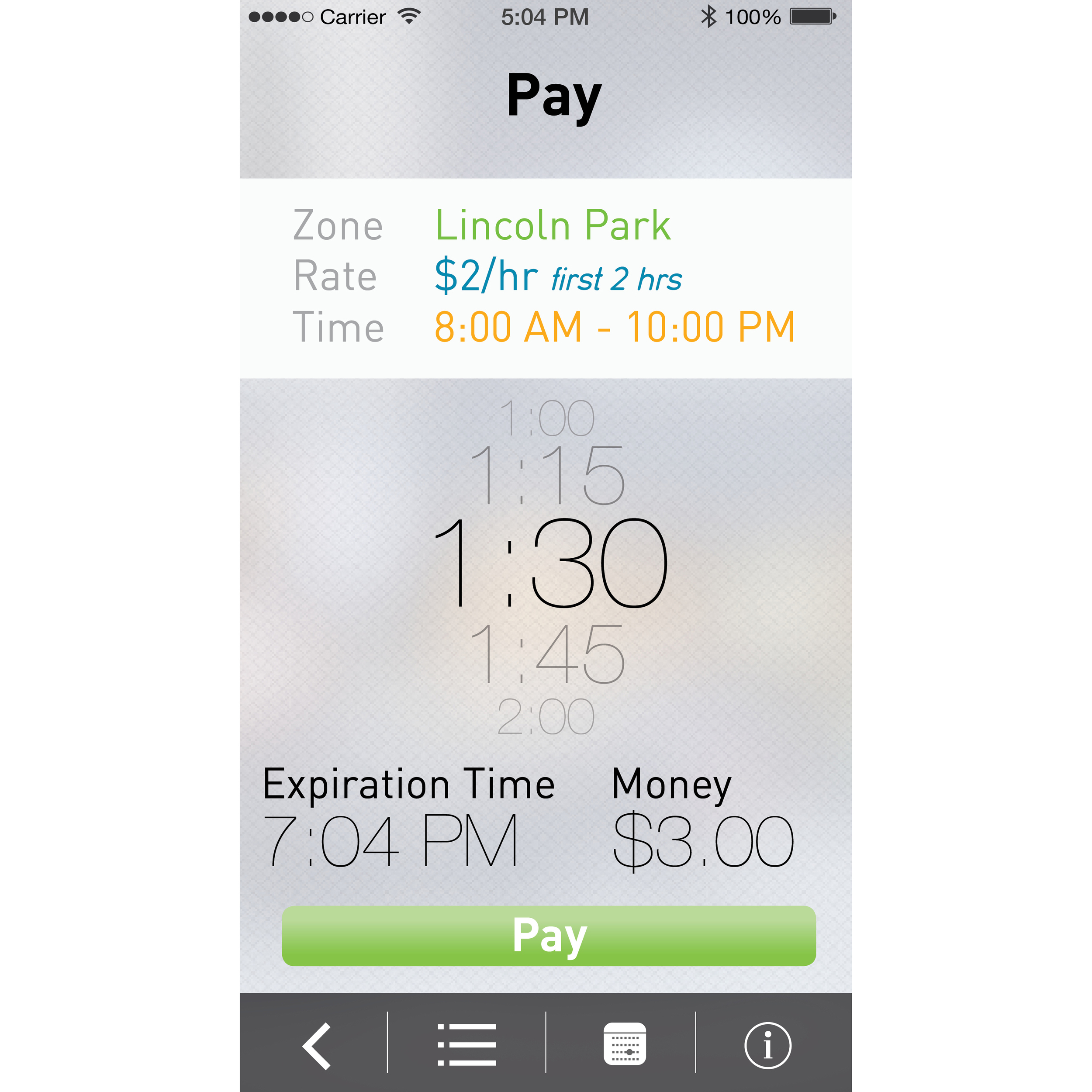
It's kind of fun to look back at some of my older work. This was an assignment given in my Intro to Communication Design I class (in 2013) where we had to create an application to make parking easier within the city of Chicago. The assignment is no longer given because ParkChicago and SpotHero now exist, but at the time, nothing existed outside of the physical parking meters.
I realize that some of my choices were stylistic for the time (design moves quickly) but others were due to being new to the world of design.
1. Seeing the icon is a little cringeworthy at this point. It's hopelessly forthright without even trite symbolism. At least I was playing around with opacity...
2. One interesting piece is that I notice now how chunky everything feels. Earlier versions of iOS suffered from this problem. Turns out our fingers are pretty nimble and we don't need buttons as large as our hands to make a correct selection.
3. I was going for a green color motif, however, I never really made it very clear.
4. Nobody hates QR codes more than I do, but I decided to use one in this case. The idea was that even if you didn't have wifi, you could still use your phone to communicate with a physical parking meter to let the system know that you had parked. With the advancement of beacon and Bluetooth tech, hopefully we never have to make these decisions again.
5. I chose an interesting "swipe menu" which displays the card and car that a user might be using. After taking a human factors class, I understand that such a gesture is uncomfortable and requires the user to put the phone in a compromising position (with respect to falling out of the hand).
6. Trying to help the user understand how much they were paying per hour and what time their parking would expire was probably the most difficult point. I used lots of different colors to try to solve this issue but I think that added too much noise to a screen with enough numbers on it already.
7. I still like the blurred background and layering effects that I used, so at least I have that going for me.


